So after several long and agonizing debates between myself and... myself, I have decided to present my Board Shorts Review 2009 in the following format:
Intro
Filler
Pics
More Filler
Conclusion
I think that's pretty standard formatting. Formatting is important right? I mean continuity and the expected are what writing is all about. I beat the shit out of spontaneity in the parking lot last night and nonconformity knows better than to show that ugly mug 'round here. I don't write for me, I write for the English language. I'm also a bit unhinged.
Look, whatever it is that I just wrote up there isn't really important. What is important is the fact that you and I are here. Now. Well, sort of now... I mean I already wrote this and you're reading it at some point after the fact, so I guess that's all just a lie and I've been exposed for the fraud I am. Well done. You have ruined what was left of the life of a broken man. Not me, but some other dude who takes all of this way too seriously. Honestly I don't know what's wrong with people.
Right. Anyway, on with the show: so for those of you who are unfamiliar with the board short genre, these glorious swim trunks come in lengths ranging from 18"-23" and are sized like pants in the waist. Every year there is some new technological development which makes that season's shorts weigh less, dry faster, or increase your sperm count. If you're interested in a performance breakdown, this is the wrong place for you. Aesthetics are what we're all about over here, plain and simple.
I don't want to make an opus out of this deal, but I recognize that there are styles aplenty out there and I don't want you to think I skimped on the research, so for those who want to see the entire catalog I considered, check out this fancy flickr page I made.
For the rest of you lazy Susans, I shall drop the science like so:
HAWTNESS ON A BUDGET: gotta rep the hometown heroes at Target. Sure they rip off designs from everyone and their mother, but you can't beat that style for those prices. Close second: Ye Old Navy.
NEW BIG NAME HAWTNESS: So the style cues for this season are shorter shorts and an '80's neon vibe. Sure there are offerings that still rock the bad tattoo-ink stylings of the last few years, but we at Newrosis like to dance near the front, so if you want camo printed tramp-stamped old lameness, try the discount section at PacSun (seriously).

Billabong: You know you'll get quality and style, but let's be honest: every third grom at the beach is going to have your shorts. Exclusivity is the key to a satisfying life. That's a central Minnesotan proverb, and real words to live by. Grade: B-
DC Shoes: The DC logo/branding is timeless. I love it. LOVE IT. Some of their non-branded pieces are also pretty intriguing, but nothing mind blowing. The Biff is the creme de la creme. Grade: B

Fox: I don't know why motocross riders need board shorts, but I also don't know why ostriches have wings. We'll chalk it up to an evolutionary oversight. I was pleasantly surprised by some of the styling, particularly the Vortex, but of course they have to have that god-awful fox displayed as prominently as possible. Grade: C+
Hurley: My favorite Lost character, and also ubiquitous symbol of SoCal circa 2000. I'm not crazy about their stuff, but the Icon at least makes it hard to see whose shorts you're wearing. Grade: C-

Quiksilver: The winner among the big boys in my opinion. The Cool Out and Mo Massive are slick as hell, but you know you won't be the only one wearing them. Grade: A-
O'neill: Disqualified for having the most ridiculous non user friendly website ever. EVER. Grade: F

Rusty: Overall not great, but the Snake Charmer and St Francis are good looking shorts that might be a little more under the radar. Grade: B
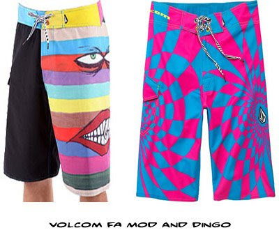
Volcom: I mean, by this point in the review, I'm just seeing too many of the same styling cues and patterns to give any of the Volcom designs high marks. The Dingo looks seirzure-inducing, if you're into that sort of thing.
BEST OF 2009...as of now anyway...

RRD Sideshore Mondrain: Best Overall

Quiksilver Cool Out: Best Big-Name Short

RRD Glitter: Most Unlikely to be Worn

O'Shea Starstruck: Best Import

RVCA Synchronicity: Best "Conservative" Short
Best overall line for this summer goes to
RRD (Roberto Ricci Designs). Far and away the most unique shorts I've seen. I would love to give you a rundown of why RRD is so great, but I am sick of this entire operation here and I have law to practice, so if I'm not rushing you...good day!
Remember you can check out pics of everything I looked at on the Newrosis Flickr page.